
Luna Budgeting App
Luna Budgeting App
Luna Budgeting App
2024 - Current
2024 - Current
2024 - Current

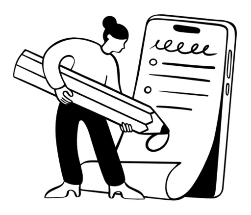
Creating a design system for a budgeting app with an enjoyable experience to help curb spending.
Creating a design system for a budgeting app with an enjoyable experience to help curb spending.
Creating a design system for a budgeting app with an enjoyable experience to help curb spending.
✨ Overview
✨ Overview
✨ Overview
ROLE
ROLE
ROLE
Freelance
Freelance
Freelance
Product Designer
Product Designer
Product Designer
UI Design, UX Design, Rapid Prototyping, User Flows, Interaction Design, Illustrations
UI Design, UX Design, Rapid Prototyping, User Flows, Interaction Design, Illustrations
UI Design, UX Design, Rapid Prototyping, User Flows, Interaction Design, Illustrations
PLATFORM
PLATFORM
PLATFORM
iOS
iOS
iOS
TIMELINE
TIMELINE
TIMELINE
2024 - Current
2024 - Current
2024 - Current
STATUS
STATUS
STATUS
Shipped to Production
Shipped to Production
Shipped to Production
DELIVERABLES
DELIVERABLES
DELIVERABLES
Design
Design
Design
User Flow, Wireframes, High-Fidelity Prototype, Design System
User Flow, Wireframes, High-Fidelity Prototype, Design System
User Flow, Wireframes, High-Fidelity Prototype, Design System
OVERVIEW
OVERVIEW
OVERVIEW
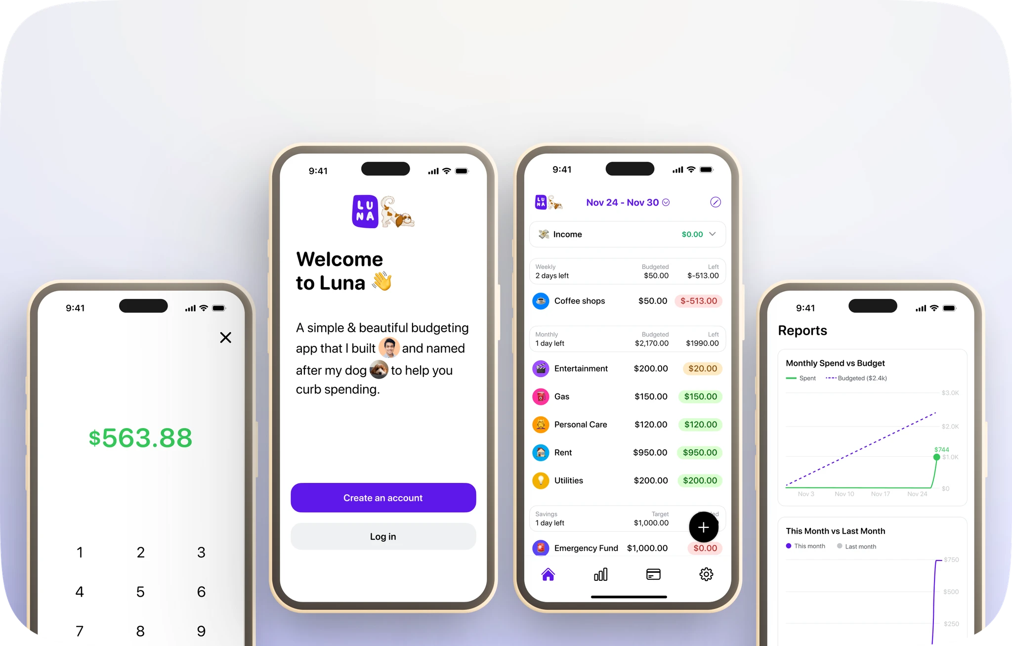
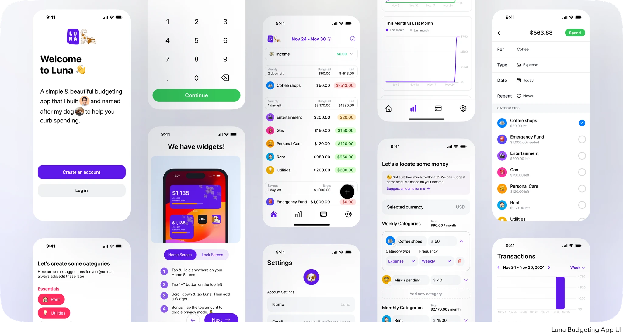
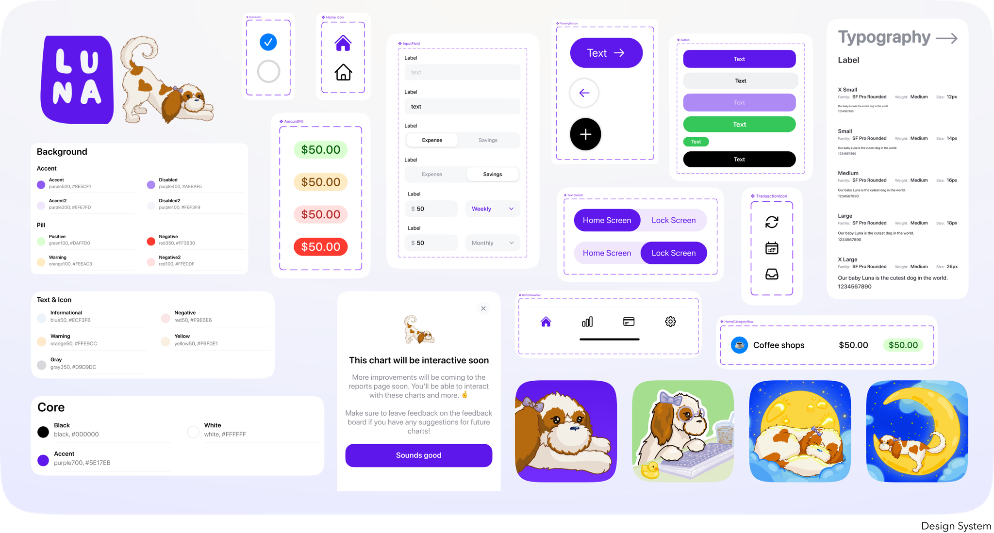
I partnered with Chris, a solo-app developer, to help design a budgeting app that is simple, beautiful, and intuitive to use. Chris had started SwiftUI development on the project but realized that the user experience became too disjointed when designing on the fly in the codebase. He reached out to me to help create a concrete design system for the application to solidify colors, typography, illustrations, and components so that development of future features would be faster and easier without the cognitive load of UI design on top of coding.
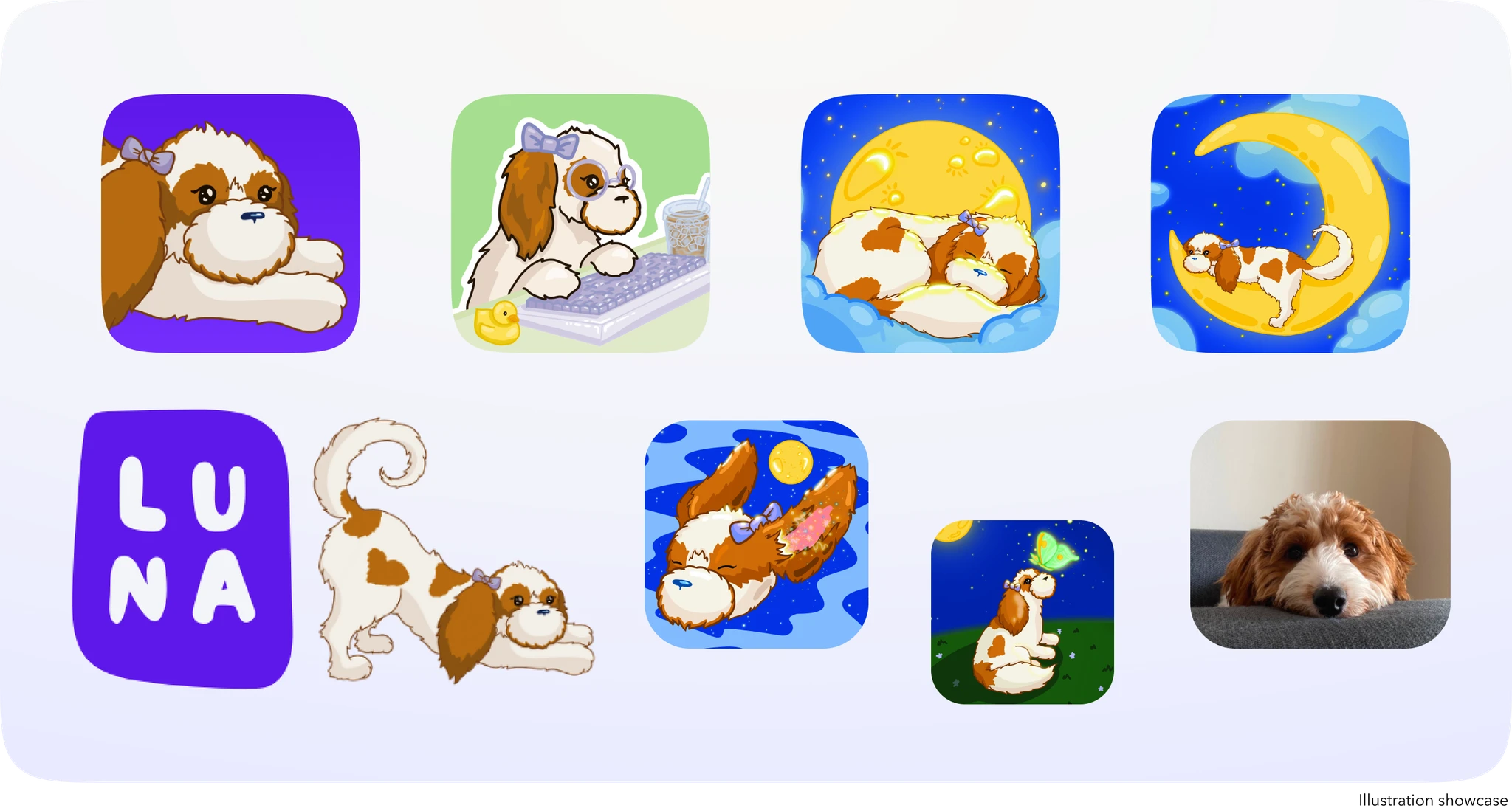
I also helped to create custom illustrations for the app that helped set the tone and portray a playful and enjoyable experience. With the design system in place, we are currently continuing to design and develop new features and user flows for the Luna Budgeting App.
We have now launched many collaborative features for the app, but I will be focusing on creating the Design System for the purposes of this case study.
I partnered with Chris, a solo-app developer, to help design a budgeting app that is simple, beautiful, and intuitive to use. Chris had started SwiftUI development on the project but realized that the user experience became too disjointed when designing on the fly in the codebase. He reached out to me to help create a concrete design system for the application to solidify colors, typography, illustrations, and components so that development of future features would be faster and easier without the cognitive load of UI design on top of coding.
I also helped to create custom illustrations for the app that helped set the tone and portray a playful and enjoyable experience. With the design system in place, we are currently continuing to design and develop new features and user flows for the Luna Budgeting App.
We have now launched many collaborative features for the app, but I will be focusing on creating the Design System for the purposes of this case study.
✨ Highlights
✨ Highlights
✨ Highlights

✨ The Challenge
✨ The Challenge
✨ The Challenge

Problem Framing
Problem Framing
Problem Framing
Before the creation of the design system, the Luna Budgeting App had too many shades of the same color and an inconsistent use of typography and components. Chris was making design decisions as he was coding which slowed down the process of development when having to think of all the design considerations. We needed to create a cohesive design system while also keeping the fun and playful vibes that Chris wanted the experience to portray. Because the app was already under development, I went in to audit what was already there and what could be improved and streamlined. I was also tasked with creating custom illustrations that match the playfulness of the experience, which was also a fun challenge to take on!
Before the creation of the design system, the Luna Budgeting App had too many shades of the same color and an inconsistent use of typography and components. Chris was making design decisions as he was coding which slowed down the process of development when having to think of all the design considerations. We needed to create a cohesive design system while also keeping the fun and playful vibes that Chris wanted the experience to portray. Because the app was already under development, I went in to audit what was already there and what could be improved and streamlined. I was also tasked with creating custom illustrations that match the playfulness of the experience, which was also a fun challenge to take on!
Before the creation of the design system, the Luna Budgeting App had too many shades of the same color and an inconsistent use of typography and components. Chris was making design decisions as he was coding which slowed down the process of development when having to think of all the design considerations. We needed to create a cohesive design system while also keeping the fun and playful vibes that Chris wanted the experience to portray. Because the app was already under development, I went in to audit what was already there and what could be improved and streamlined. I was also tasked with creating custom illustrations that match the playfulness of the experience, which was also a fun challenge to take on!
Pinpointing Issues
Pinpointing Issues
Pinpointing Issues
Inconsistent components throughout the app
Inconsistent components throughout the app
Inconsistent components throughout the app
Too many shades of the same color
Too many shades of the same color
Too many shades of the same color
Could not find existing illustrations that match the essence of the app
Could not find existing illustrations that match the essence of the app
Could not find existing illustrations that match the essence of the app

No system which causes disjointed user flows and increased time when creating new features
No system which causes disjointed user flows and increased time when creating new features
No system which causes disjointed user flows and increased time when creating new features
✨ The Solution
✨ The Solution
✨ The Solution
Our Goals
Our Goals
Our Goals
Our ultimate goal was to create a unified design system for the application so that the development workflow is faster and more streamlined for the developer. By creating cohesive colors, typography, components, patterns, and illustrations, it will be easier to create user flows without having to worry about consistency.
Our ultimate goal was to create a unified design system for the application so that the development workflow is faster and more streamlined for the developer. By creating cohesive colors, typography, components, patterns, and illustrations, it will be easier to create user flows without having to worry about consistency.
Our ultimate goal was to create a unified design system for the application so that the development workflow is faster and more streamlined for the developer. By creating cohesive colors, typography, components, patterns, and illustrations, it will be easier to create user flows without having to worry about consistency.
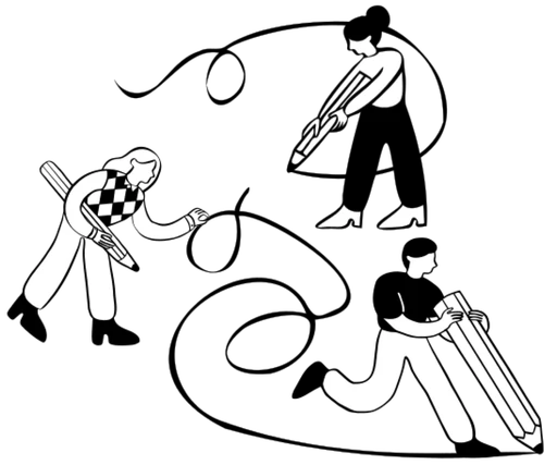
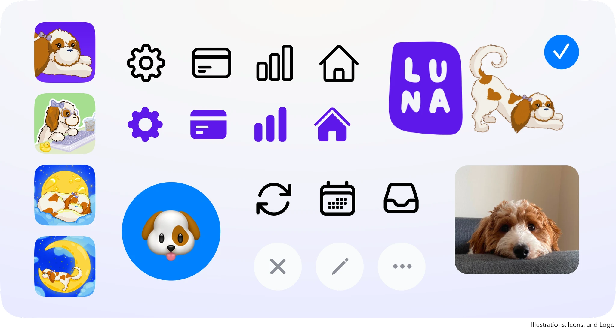
We also wanted to create custom illustrations that strengthened the brand of the app and elevated the user experience. These illustrations would be used throughout the app for the logo, empty states, customizable app icons and more.
We also wanted to create custom illustrations that strengthened the brand of the app and elevated the user experience. These illustrations would be used throughout the app for the logo, empty states, customizable app icons and more.
We also wanted to create custom illustrations that strengthened the brand of the app and elevated the user experience. These illustrations would be used throughout the app for the logo, empty states, customizable app icons and more.
High Level Goals
High Level Goals
High Level Goals
Unified components throughout the app
Unified components throughout the app
Unified components throughout the app
Consistent colors and typography
Consistent colors and typography
Consistent colors and typography
Custom illustrations that elevate the feel of the app
Custom illustrations that elevate the feel of the app
Custom illustrations that elevate the feel of the app
Solidified design system to create faster work flows for user flows and features
Solidified design system to create faster work flows for user flows and features
Solidified design system to create faster work flows for user flows and features
✨ Research Summary
✨ Research Summary
✨ Research Summary
Design System Inspiration
Design System Inspiration
Design System Inspiration

In order to better understand design systems at other companies, I did a deep dive of examples. I wanted to understand how other companies organized their systems and what was included. At the time, I also worked on the design system for Capital One as an iOS software engineer developing our reusable components and tokenized assets. With this background and working with design system designers everyday, I was exposed to the way enterprise design systems worked and looked to incorporate that for the Luna Budgeting App.
In order to better understand design systems at other companies, I did a deep dive of examples. I wanted to understand how other companies organized their systems and what was included. At the time, I also worked on the design system for Capital One as an iOS software engineer developing our reusable components and tokenized assets. With this background and working with design system designers everyday, I was exposed to the way enterprise design systems worked and looked to incorporate that for the Luna Budgeting App.
In order to better understand design systems at other companies, I did a deep dive of examples. I wanted to understand how other companies organized their systems and what was included. At the time, I also worked on the design system for Capital One as an iOS software engineer developing our reusable components and tokenized assets. With this background and working with design system designers everyday, I was exposed to the way enterprise design systems worked and looked to incorporate that for the Luna Budgeting App.
High Level Audit
High Level Audit
High Level Audit
I went into the code base to understand all of the different colors and fonts that were currently in use. I also took screenshots to analyze not only the colors, but also the spacing, corner radius, text, interaction design, haptic feedback, simplicity, and the way information is presented to the user to understand how these all affect the look and feel of the app.
I went into the code base to understand all of the different colors and fonts that were currently in use. I also took screenshots to analyze not only the colors, but also the spacing, corner radius, text, interaction design, haptic feedback, simplicity, and the way information is presented to the user to understand how these all affect the look and feel of the app.
I went into the code base to understand all of the different colors and fonts that were currently in use. I also took screenshots to analyze not only the colors, but also the spacing, corner radius, text, interaction design, haptic feedback, simplicity, and the way information is presented to the user to understand how these all affect the look and feel of the app.
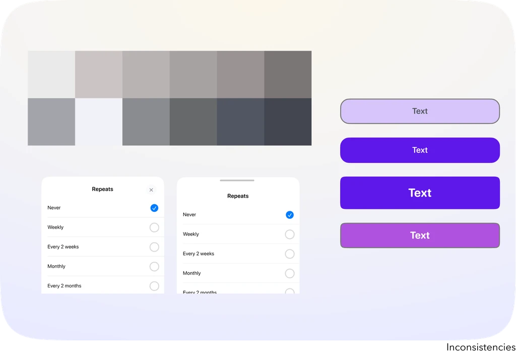
During the audit, I found that there were too many shades of the same colors being used, such as over 20 shades of warm and cool toned grays and a disjointed use of typography. There were also components that had different user interfaces and designs throughout the app such as the button or the bottom sheet.
During the audit, I found that there were too many shades of the same colors being used, such as over 20 shades of warm and cool toned grays and a disjointed use of typography. There were also components that had different user interfaces and designs throughout the app such as the button or the bottom sheet.
During the audit, I found that there were too many shades of the same colors being used, such as over 20 shades of warm and cool toned grays and a disjointed use of typography. There were also components that had different user interfaces and designs throughout the app such as the button or the bottom sheet.
✨ Design Process
✨ Design Process
✨ Design Process
Tools
Tools
Tools

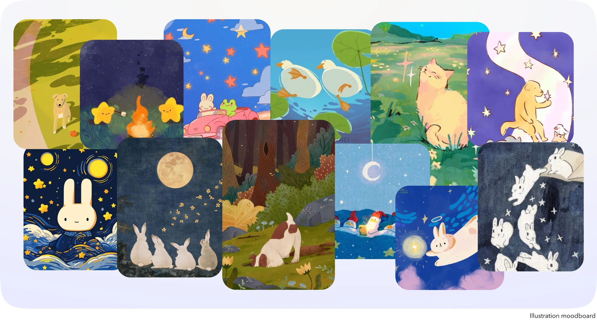
Moodboarding
Moodboarding
Moodboarding

Ideation
Ideation
Ideation
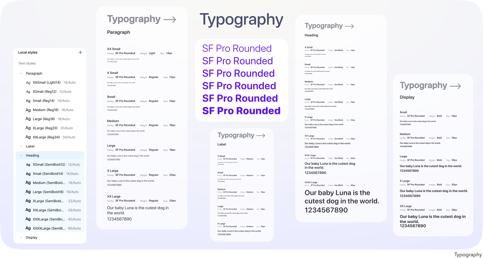
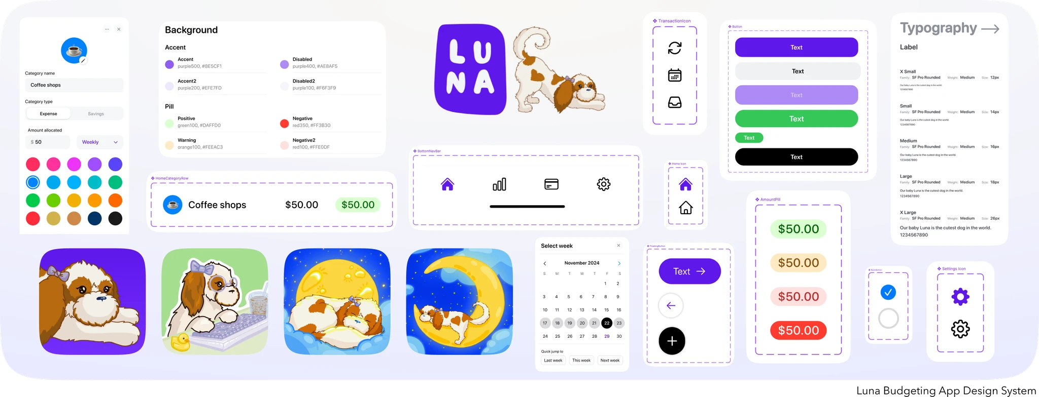
The first step was to figure out how to organize everything while pulling inspiration from other design systems. I decided to focus on organizing colors in an intuitive way based on what they are used for such as Background, Text & Icon, Borders, and more. The typography is ultimately organized based on font weight to give more flexibility and findability when developing. I also had to figure out which colors and font styles to keep and remove based on the audit. When making design decisions, I wanted the findability of the colors, typography, and components to be quick and intuitive for an improved design and development workflow.
The first step was to figure out how to organize everything while pulling inspiration from other design systems. I decided to focus on organizing colors in an intuitive way based on what they are used for such as Background, Text & Icon, Borders, and more. The typography is ultimately organized based on font weight to give more flexibility and findability when developing. I also had to figure out which colors and font styles to keep and remove based on the audit. When making design decisions, I wanted the findability of the colors, typography, and components to be quick and intuitive for an improved design and development workflow.
The first step was to figure out how to organize everything while pulling inspiration from other design systems. I decided to focus on organizing colors in an intuitive way based on what they are used for such as Background, Text & Icon, Borders, and more. The typography is ultimately organized based on font weight to give more flexibility and findability when developing. I also had to figure out which colors and font styles to keep and remove based on the audit. When making design decisions, I wanted the findability of the colors, typography, and components to be quick and intuitive for an improved design and development workflow.
✨ Visual Elements
✨ Visual Elements
✨ Visual Elements


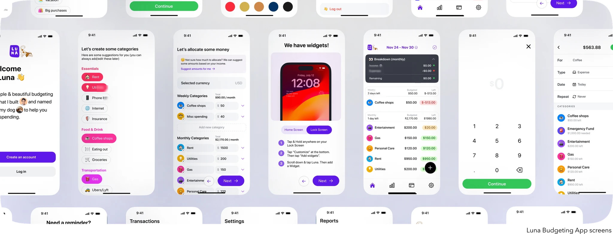
✨ Final Designs
✨ Final Designs
✨ Final Designs
Prototype
Prototype
Prototype
✨ Developer Handoff
✨ Developer Handoff
✨ Developer Handoff
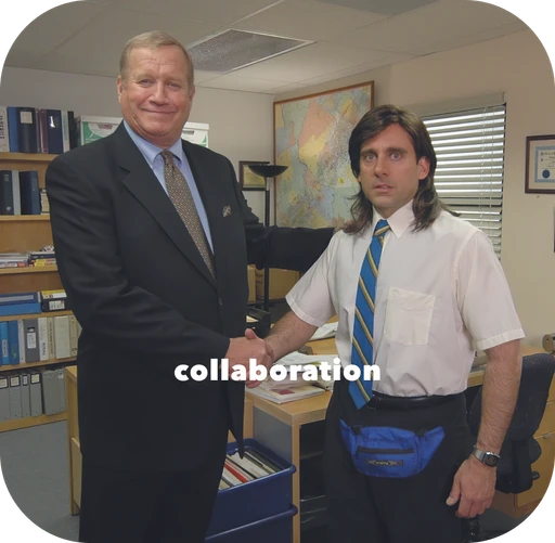
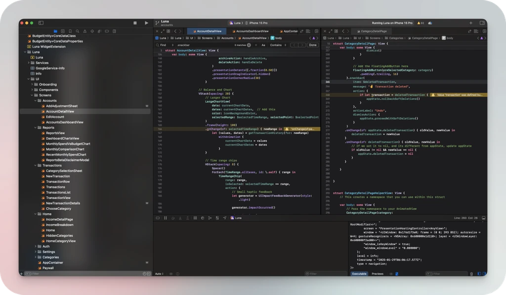
As the designer, I needed to collaborate closely with Chris to fully understand his vision for the app. Keeping the playfulness of the app was crucial when creating the design system and custom illustrations. With the design system created, all of the color and font decisions needed to be accessible in the code base as well as the creation of reusable components in the code base. This was the final step in integrating the design system into the development workflow for a better experience when creating new features. Because Chris is already familiar with Figma, understanding the design specifications and porting them over to the code base was a seamless experience.
As the designer, I needed to collaborate closely with Chris to fully understand his vision for the app. Keeping the playfulness of the app was crucial when creating the design system and custom illustrations. With the design system created, all of the color and font decisions needed to be accessible in the code base as well as the creation of reusable components in the code base. This was the final step in integrating the design system into the development workflow for a better experience when creating new features. Because Chris is already familiar with Figma, understanding the design specifications and porting them over to the code base was a seamless experience.
As the designer, I needed to collaborate closely with Chris to fully understand his vision for the app. Keeping the playfulness of the app was crucial when creating the design system and custom illustrations. With the design system created, all of the color and font decisions needed to be accessible in the code base as well as the creation of reusable components in the code base. This was the final step in integrating the design system into the development workflow for a better experience when creating new features. Because Chris is already familiar with Figma, understanding the design specifications and porting them over to the code base was a seamless experience.
✨ Reflections
✨ Reflections
✨ Reflections
Key Takeaways
Key Takeaways
Key Takeaways
Design systems allow for a faster workflow
Design systems allow for a faster workflow
Design systems allow for a faster workflow
Design systems ensure a cohesive experience for the user
Design systems ensure a cohesive experience for the user
Design systems ensure a cohesive experience for the user

Custom illustrations elevate the app
Custom illustrations elevate the app
Custom illustrations elevate the app
Communication and collaboration allow for the best results
Communication and collaboration allow for the best results
Communication and collaboration allow for the best results
Simplicity for your users is key
Simplicity for your users is key
Simplicity for your users is key
Design and engineering are symbiotic
Design and engineering are symbiotic
Design and engineering are symbiotic
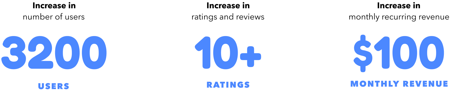
Impact
Impact
Impact
Next Steps
Next Steps
Next Steps
With the app launched and in the Apple App Store, we are continuing to design new user flows and features based on the feedback board for Luna App users. This includes creating new components when necessary and the continued use of the design system in our current workflow. We are also working on some new illustrations as well!
The current feature we are working on is integrating the concept of Accounts within the app. Currently, the app is strongest when used as an expense tracker, but the future roadmap includes a zero-based budgeting mindset so that users can further customize the app to their needs. We’ve got a lot of new features and designs on the roadmap, so stay tuned!💕
Thank you for checking out this project!
💫 case studies
© 2025– Cecilia Yeji Kim
made with love and iced strawberry matcha lattes 🫶🏼🧊🍓🍵
💫 case studies
© 2025– Cecilia Yeji Kim
Made with love and
iced strawberry matcha lattes ✨🫶🏼🍓🍵
💫 case studies
© 2025– Cecilia Yeji Kim
Made with love and
iced strawberry matcha lattes ✨🫶🏼🍓🍵